Seeking Stillness

Seeking Stillness
Brand refresh
- Icon redraw
- Strapline
- Typography
- Colour palette
- Brand execution
Seeking Stillness is a brand dedicated to mindfulness and self-discovery, offering treatments and experiences that cultivate inner peace. The original branding needed refinement to align more closely with its core values of simplicity, clarity, and balance.
The original logo had strong conceptual foundations but needed refinement for clarity and scalability. The updated icon simplifies the design, enhancing recognition while maintaining its meditative feel. The refined linework and balanced proportions create a mark that feels intentional and timeless.
Colour Palette
The client wanted to keep pink as the dominant colour; however, the existing palette felt muted and lacked energy. To infuse new life into the brand, we explored vibrant shades of pink found in nature—drawing inspiration from flamingos, lotus flowers, and dragon fruit.
The result is a colour that feels both grounded and invigorating, reflecting Seeking Stillness’s essence of mindful energy and renewal.
Typography
The old typeface didn’t work with the icon and the letter spacing threw the balance off. A harmonious pairing of serif and sans-serif typefaces ensures legibility while reinforcing the brand’s serene and elegant tone.
Brand execution
With a refined identity in place, consistency across all touchpoints was key. The new branding seamlessly integrates across digital platforms, social media, print materials, and signage, ensuring a cohesive brand experience.


OLD | NEW

YOUR CREATIVE PARTNER

We are more than just a design agency. We are your partners in creating unforgettable digital experiences that resonate and inspire. Contact us and let’s create something amazing together.
Please fill out all your details in the form, with as much information about your project as possible and we’ll get back to you within 24 hours.
If you’d prefer to speak on the phone, please leave your number with a convenient time to call and we’ll give you a ring.
Alternatively you can email: enquiries@allseeingeyedesign.co.uk
HOP Projects

HOP PROJECTS
Established in 2017 and based in Folkestone’s Creative Quarter, HOP Projects CT20 is a non-profit organisation co-led by architect Nina Shen-Poblete and artist Tomas Poblete, whose mission is to bring down barriers between audience and the ‘white walls’, making contemporary art relevant and far-reaching to a wide audience, by presenting pioneering & diverse content with strong impact that counters negative gentrification.
HOP needed a logo that could seamlessly represent its diverse work across the creative industry while maintaining a strong yet adaptable identity. It had to be versatile enough to work across various applications—digital, print, signage—without overshadowing the artwork it supports.


A Flexible Identity for a Creative Hub
We developed a bold yet minimal identity that thrives in black and white, ensuring it acts as a neutral but distinctive mark across all HOP’s projects. The design reflects the fluid nature of their creative network while maintaining clarity and recognisability across multiple arms of the business, including projects, studio residencies, and market initiatives.
The final logo strikes the right balance between flexibility and impact. Whether displayed on a gallery wall, a website, or print collateral, it provides a strong foundation for HOP’s evolving creative ventures—always present, never intrusive.
Start
Your
Project
Ready to bring your vision to life with All-Seeing Eye Design?
Please fill out the form, with as much information about your project as possible and we’ll get back to you within 24 hours.
GaGa Milano
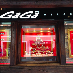
GaGà Milano is a company founded in 2004 thanks to the versatile creativity of Ruben Tomella; it owes its name to a particular way of living, looking and dealing with the world.
To celebrate the 10th year anniversary we partnered with Mo Coppoletta, working closely together to re-design their logo. The new design had to retain an element of the look and feel of the original logo as not to alienate their already strong fan base, but also be different enough to show the companies new modern direction.
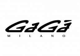
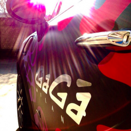
The iconic logo is not only used on the companies many product lines but also across all of their branding at fashion events, races, and retail stores.
GaGà Milano currently has 8 stores all over the world including Tokyo, Hawaii, Milan, and a new store in Brighton Way Beverly Hills, all of which have adopted this new logo.
Video and implementation pictures provided by gagamilano.com
Start
Your
Project
Ready to bring your vision to life with All-Seeing Eye Design?
Please fill out the form, with as much information about your project as possible and we’ll get back to you within 24 hours.
Thameside Pianos
Thameside Pianos
Striking the Right Chord: Branding Thameside Pianos
Thameside Pianos provide professional piano tuning and repair services in Kent, Essex and into London. We developed a branding concept that encapsulates the brand’s commitment to quality, craftsmanship, elegance, and musical excellence.
The project’s core objective was to create a sophisticated and timeless brand identity that resonates with discerning customers who appreciate quality and artistry.


Brand Identity Development
A visual identity that combines modern design elements with traditional elegance.
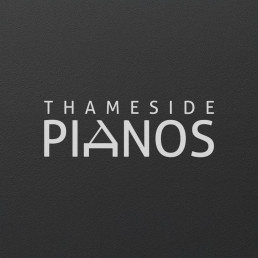
The challenge was to create a clean, professional brand that highlights their craftsmanship while maintaining a timeless aesthetic. The monochrome palette symbolizes the precision, clarity, and heritage associated with their work. The ‘A’ in the word ‘PIANOS’ is a refined, minimalist representation of a grand piano, using the opened lid to create the A-line. The design is both iconic and versatile, suitable for various applications, from digital media to print. Your logo should represent your business when you’re not there to explain it, and the ‘Thameside Pianos’ logo does exactly what it says on the tin.
A bold, modern sans-serif typeface was chosen to give the brand a strong, professional presence. The exclusive use of black and white emphasizes clarity and simplicity, mirroring the precision required in piano tuning and repairs.
To ensure consistency across all touchpoints, I developed a range of branded materials, including:
- Business Cards: Designed with a luxurious finish, featuring the logo in spot-UV finish on a dark black background for high contrast, symbolising prestige and professionalism.
- Digital Stationery: A cohesive set of letterheads and email signatures, all reflecting the brand’s aesthetic, ensuring a polished and professional presentation in all communications.
- Brand Guidelines: We created a comprehensive brand guideline document to maintain brand integrity across all channels. The guidelines detail the correct usage of the logo, typography, and other brand elements, ensuring that the brand’s identity remains consistent and recognisable.
Single page website design
The site delivers all key information in a concise, visually appealing layout, minimising distractions and guiding visitors toward taking action…


YOUR CREATIVE PARTNER

We are more than just a design agency. We are your partners in creating unforgettable digital experiences that resonate and inspire. Contact us and let’s create something amazing together.
Please fill out all your details in the form, with as much information about your project as possible and we’ll get back to you within 24 hours.
If you’d prefer to speak on the phone, please leave your number with a convenient time to call and we’ll give you a ring.
Alternatively you can email: enquiries@allseeingeyedesign.co.uk
Bar Termini
BAR TERMINI
We designed the branding for London’s prestigious coffee and cocktail bar, Bar Termini. It was created by Marco Arrigo and Tony Conigliaro, the alco-alchemist behind 69 Colebrooke Row and since Bar Termini’s opening in London along Old Compton street, it has received rave reviews from the likes of Timeout and The Evening Standard.
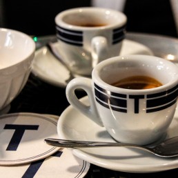
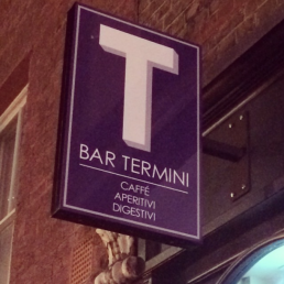
The sign which hangs elegantly above the outside of the bar is inspired by the Tabacchi (Tobacco) sale signs of Italy, and the rest of the branding compliments this style.
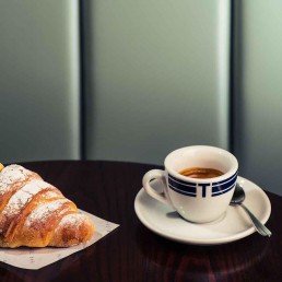
The napkins, coasters, food wraps and coffee cup design’s all follow this simplistic but bold blue look which makes the bar feel modern but also subtly hints towards its roots in Italy.
Appeared on The World’s 50 Best Bars list for three years in a row from 2016 to 2018 | 4.6 stars with 1,265 Google reviews |
A timeless
brand identity
Our branding design for Bar Termini focuses on a meticulous blend of traditional Italian elegance with a modern twist. From the typography to the color palette, it beautifully captures the essence of Italian café culture while ensuring a contemporary and inviting atmosphere. The cohesive identity created through the careful selection of materials, signage, and packaging not only enhances the customer experience but also solidifies Bar Termini’s position as a distinctive and memorable brand in the heart of London. This exemplifies the power of thoughtful design in creating a timeless brand identity.
Start
Your
Project
Ready to bring your vision to life with All-Seeing Eye Design?
Please fill out the form, with as much information about your project as possible and we’ll get back to you within 24 hours.


